Header and footer
There are two ways to make the header and the footer:
- Templates made with the builder (recommended): any layout, a different design per device, a sticky version, display conditions. Start from one of 16 ready-made headers and 11 footers.
- The classic header and footer: chosen and styled in Theme Options, without the builder. They show wherever no header or footer template applies.
Making a header
- Go to Templates → Add template, choose Header.
- Pick a design from the gallery (classic, centered logo, split menu, transparent, shop, minimal burger, side header…), name it, and click Create and open in BlueBuilder.
- Change it like any page: replace the logo, choose the menu in the Menu element, add or remove buttons and icons.
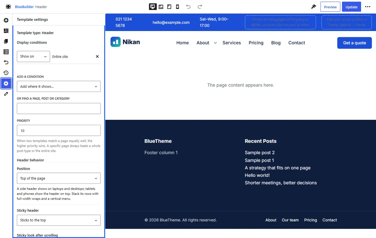
- In the Template settings tab, add a display condition such as Entire site and click Save display settings. The header now shows on the site.
Rows and devices
A header is made of ordinary sections, one per row: a top bar, the main row, a bottom row. Rows use Wrap layout → Start, center and end zones: the first wrap sits at the start, the last at the end and a middle one in the center, with its elements side by side.
Each row can be shown on some devices only, with Hide on in its Advanced tab. The ready-made headers have a full row for desktop and laptop, and a simpler row (logo, search, menu button) for tablets and phones. To change the phone header, choose Mobile in the device switcher.
Header elements
| Element | What it shows |
|---|---|
| Logo | The logo from Theme Options, with its sticky and mobile versions. |
| Menu | A menu from Appearance → Menus, with its mega menus. |
| Burger Menu | A menu button that opens the mobile menu or a side panel. |
| Search | A search icon that opens a search panel, or a search field. |
| Cart, Wishlist, Account | Shop icons with counts (with WooCommerce). |
| Language Switcher | Links to the page in other languages (Polylang or WPML). |
| Header Text | A phone number, an email, a short offer, with an icon. |
| Social Icons, Dark Mode Toggle, Button | As their names say. |
Header behavior
In Template settings → Header behavior:
| Setting | What it does |
|---|---|
| Sticky header | Sticks to the top when the page scrolls, or Off: scrolls away with the page. |
| Shrink rows and logo | Makes the sticky header slimmer. |
| Background when sticky, Text color when sticky | A different look once the page has scrolled. |
| Shadow under the header | A shadow while sticky. |
| Transparent header | The header floats over the first section of the page, for a hero image. Choose Light, for dark images or Dark, for light images text. |
| Side header | Side bar at the start or at the end: the header becomes a vertical bar beside the page on large screens, with a Side header width. On tablets and phones it is an ordinary top header. |
A row you don't want in the sticky header (often the top bar) can be hidden there with Hide this row when the header sticks, in the row's Advanced tab.
Tip To use a transparent header on some pages only, keep your normal header for the entire site and choose a transparent one for those pages in Page Options → Header → Transparent header template.
Making a footer
The same way: Templates → Add template → Footer, pick a design, change it, and give it display conditions. Footer behavior in Template settings offers:
- Footer style: As in Theme Options → Footer, Default: after the content, Stays at the bottom of short pages, or Revealed as the page scrolls up (laptops and desktops), where the page slides away to uncover the footer.
Footers use the same elements as pages, plus Copyright (the year updates by itself) and Menu for a row of links.
The classic header and footer
If you prefer settings to the builder:
- Header: Theme Options → Header & Subheader → Header. Choose one of 16 header styles, the header height, position (above the content, or transparent over the first section) and colors. Header elements sets the search, the shop icons (cart, wishlist, account), an action button and the language switcher.
- Sticky header: Header & Subheader → Sticky header.
- Footer: Theme Options → Footer → Layout: widget columns (from one to six, equal or in mixed widths) filled from Appearance → Widgets, a call-to-action strip, and the copyright bar.
The classic header and footer show wherever no template applies, so a site can use a builder header and the classic footer, or the other way round.
The subheader (title bar)
Below the header, pages show a title bar with the page title and breadcrumbs. Set its layout, background and height in Theme Options → Header & Subheader → Subheader, hide it on one page in Page Options → Title bar, and turn breadcrumbs on or off in Breadcrumbs. Single, archive and 404 templates hide it unless their settings keep it.