Menus and mega menus
Menus and their places
Make menus in Appearance → Menus, then put each in a place under Menu Settings → Display location:
| Location | Where it shows |
|---|---|
| Primary menu | The main menu of the classic header. |
| Mobile menu (falls back to Primary) | The phone menu panel. Leave it empty to use the primary menu there too. |
| Footer menu | The classic footer's copyright bar. |
| Split menu, second half (optional) | The second menu of the "split menu" header styles, with the logo between the two. |
| Action bar menu | The thin bar above the classic header. |
In header and footer templates, the Menu element shows any menu you choose, so locations matter only for the classic header and footer.
How menus look
Theme Options → Menu & Action Bar → Menu sets the style of the menu items (default, highlight, line below, line above, arrow, pill), the hover animation, alignment and spacing, and the submenus: opened on hover or on click, their width, corners, shadow and animation. The Menu element in a header template can override the hover style for that menu.
Mega menus
A mega menu is a large dropdown with columns, images, buttons or anything the builder can make.
- Make the content: Templates → Add template → Mega menu. It starts with three columns of links and a call-to-action box. Change it in the builder.
- In Template settings, choose the Panel width: Full width, Container (the site's width), Fit the content, a Fixed width, or As in Theme Options → Menu.
- Go to Appearance → Menus, open a top-level item, and choose the template under Mega menu. Save the menu.
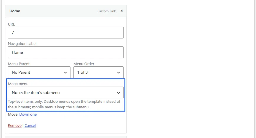
On desktops, that item opens the mega menu instead of its submenu, on hover or click as your other submenus do, and from the keyboard. On phones the item keeps its ordinary submenu, so add the most important links as sub-items too.
The mobile menu
Theme Options → Menu & Action Bar → Mobile menu:
| Setting | Choices |
|---|---|
| Type | Side panel, Full-screen overlay, or Dropdown below the header. |
| Opens from | The start side or the end side. |
| Show in the panel | Logo, search, social icons, an action button. |
| Submenus | Open in place (accordion), or slide in as a new panel. |
| Menu button | Three lines, the word "Menu", or both. |
Header templates open the same panel with the Burger Menu element.
Side panels
A side panel template replaces the mobile menu panel with a layout of your own: logo, a vertical menu, contact details, a newsletter form, social icons.
- Templates → Add template → Side panel (off-canvas). In Template settings, choose where it Slides in from and its Width.
- In your header template, select the Burger Menu element and choose the panel under Opens.
One-page sites
For a page whose menu links scroll to its sections:
- Give each section a CSS ID (Advanced tab), such as
services. - Make menu links to
#services(a Custom Link in Appearance → Menus). - On that page, turn on One-page mode in Page Options → Advanced. The menu then highlights the section being viewed.
Theme Options → Menu & Action Bar → Menu → One-page sites sets how this works on every page.
The action bar
A thin bar above the classic header: contact items (phone, email, hours) at the start, and the action bar menu, your own HTML or a language switcher at the end. Turn it on with Show the action bar in Theme Options → Menu & Action Bar → Action bar. In header templates, use a top row with Header Text elements instead.